

Struggling to read the time in dim light — this is the crossroads.
Eyes blur at a bedside glance, tiny luminous indices reduced to faint dots. The choice narrows to two paths: a watch with bigger, brighter lume or small fixes that restore visibility without a full upgrade. Tradeoffs matter—large markers help legibility but add bulk, tritium/constant-glow beats charged pigments for all-night visibility, and strap comfort determines whether a larger case will actually be worn.
- A 50-lumen keychain light gives instant, hands-free illumination for time checks.
- C3 Super-LumiNova yields a soft green glow; best after a strong charge.
- Constant-glow systems (e.g., Luminox) remain visible without recharging.


What 'most legible lume' really means
Legibility for reduced eyesight is about what the eye can quickly perceive in low light, not a manufacturer’s brightness number. Practical readability depends on the visible area of lume, the contrast it creates with the dial, and clear, simple shapes that the eye can resolve at a glance.
Key perceptual features
- Apparent luminous surface — larger painted plots and fully luminous hands matter far more than tiny dots. A broad baton hand or big round markers present more usable light than lots of thin markings.
- High contrast — a bright lume against a matte, dark dial or recessed pips with dark surrounds improves letter‑shape separation. Contrast helps the brain parse numbers and hands even when acuity is reduced.
- Simple, bold shapes — plain bars, large dots, and thick sword or syringe hands read faster than ornate hands or small printed numerals.
- Sustained glow over peak specs — claims like peak candela or short-lived flash are less useful than a lume that remains visible for hours. Constant-glow solutions (e.g., tritium tubes) or thick layers of modern pigments often feel more reliable in practice.
Quick checklist: prefer big luminous surfaces, dark high-contrast dials, and plain hand/marker geometry. These choices deliver night readability that matters more than impressive spec-sheet numbers.

Fast, measurable checks while browsing
-
Luminous surface — aim for substantial coverage
Prefer dials where hands plus markers cover roughly one‑third or more of the visible dial area. If luminous elements look noticeably smaller than the non‑luminous background, deprioritize that model.
-
Lume thickness and stroke width
Look for at least ~1.2–1.5 mm of luminous material on hands or marker strokes; very thin painted lines vanish at distance. For numerals, strokes thicker than ~1.5 mm stay readable longer.
-
High contrast between lume and dial
Bright green/blue lume on a dark dial or dark hands with luminous fill on a light dial gives the fastest read. Avoid low‑contrast combinations like pale lume on brushed metal markers.
-
Prefer simple, full shapes over skeletonized parts
Broad baton hands, bold Arabic numerals, or fully lumed dials read fastest. Skeleton hands, thin pointers, or tiny dots force extra visual processing in low light.
-
Quick in‑store tests
Charge the lume with a phone flashlight for 10 seconds, then view in a shaded area at arm’s length and from ~3 m. Note steady glow (tritium tubes) versus bright‑then‑fading Super‑LumiNova.
Tritium gives constant low‑level visibility without charging but limited colors and moderate brightness.
High‑grade Super‑LumiNova starts brighter and can outshine tritium initially but fades; larger surface area mitigates fade.
Balance immediate brightness with sustained area and contrast rather than chasing peak lume numbers.
Design myths vs reality
Peak brightness matters less than luminous area and glow duration; a slightly dimmer but larger, longer-lasting surface reads better.
Eyes perceive larger luminous patches more easily than tiny bright spots; many ‘bright’ formulations fade quickly, collapsing perceived size.
Simple, bold shapes and thick hands with strong color contrast greatly improve legibility for poor eyesight.
Clutter and fine detail compete for attention; larger strokes reduce recognition time and rely less on acuity.
Tritium’s steady glow helps, but tiny tubes must be large or combined with expanded luminous areas to be readable.
Steadiness is useful, but perceived size and stroke width determine legibility more than source type.
Tritium tubes vs phosphorescent paint
Tritium tubes and modern phosphorescent paints serve different needs. Tritium gives a constant, uncharged glow ideal for immediate night readability; Super‑LumiNova and similar paints charge from light and deliver a brighter peak that fades over hours.
Practical guidance:
- Tube size matters: common diameters run ~0.8–2.5 mm. Larger tubes or wider strips increase visible area—aim for luminous stroke widths ≥1.2–1.5 mm where possible.
- Lifespan: tritium has a half‑life of ~12.3 years; expect steady decline and practical visibility often rated ~10–25 years, with noticeable dimming after ~12 years.
- Paint lasts indefinitely but needs regular charging; best for large painted hands and markers.
For poor eyesight, prioritize large luminous surfaces and high contrast. Avoid watches with old or flaking radium — see vintage lume safety considerations for visually impaired users for details.
Always-visible dive watch
Swiss-made 45mm dive watch with constant glow illumination, sapphire crystal, 200m water resistance, and a 72‑month battery. Large dial and luminous hands favor night legibility for users needing steady visibility. Approx. price: ~$530.
Old radium can be hazardous and dim. Discolored, powdery, or flaking lume often indicates radium or severely degraded paint. Have suspicious vintage pieces checked by a professional and prefer modern replacements for safety and legibility.
Beyond lume: crystal, glass and bezels
How non‑lume features affect visibility
Crystal clarity and coatings matter. Anti‑reflective (AR) cuts glare and raises contrast at night; underside‑only AR can show purple reflections—double‑sided AR gives the best low‑light clarity but is pricier and can be more fragile. Sapphire is preferred for scratch resistance; mineral glass reflects more.
Domed vs flat glass changes viewing angles. Low‑distortion domes reduce edge glare and keep hands readable at a slant. Highly curved crystals may distort minute markers—choose low‑profile domes if precise reading is required.
Dial finish and bezel pip size affect perceived contrast. A matte dial kills reflections and improves contrast versus glossy finishes. A larger, raised bezel pip is easier to spot at a glance; recessed pips are protected but usually smaller. High‑contrast pip color (white or cream on a dark bezel) aids quick identification.
Quick preferences:
- Sapphire crystal with AR (front or both sides)
- Matte or satin dial finish
- Low‑distortion domed or flat glass depending on preference
- Larger, raised bezel pip with contrasting color
Matte dial + AR crystal often outperforms a slightly brighter lume when reflections hide the hands. Pair low‑distortion glass with a larger bezel pip for the most reliable night readability.
Real lume checks
Chronometer Check compares watches’ lume performance.
Choose a lume strategy for the night setting
-
Identify the typical night environment
If the watch must be readable in near‑total darkness for hours (bedside, nightshift, emergency kit), favor tritium. For occasional outdoor or brief indoor darkness, high‑grade Super‑LumiNova offers brighter initial glow and easier recharge.
-
Minimum index and hand-size thresholds
Aim for luminous coverage of roughly ≥33% of the dial and luminous stroke widths of about 1.2–1.5 mm on indices and hands; wider, filled hands are easier for poor eyesight.
-
When to pick tritium
Choose tritium tubes when consistent, always‑on visibility matters — tubes give steady, readable lines but dim slowly over many years.
-
When to pick Super‑LumiNova
Choose high‑grade Super‑LumiNova (C3/C5) when peak brightness matters and occasional recharging is acceptable; prioritize large, thickly painted surfaces over tiny pips.
-
In‑person dark testing steps
In-store, charge the dial with a 50‑lumen keychain light for ~5 seconds, then turn it off and watch initial brightness and fade for 5–10 minutes. Check contrast against the dial, legibility of hour marks and hands, bezel pip visibility, and reflections from the crystal while tilting the watch.
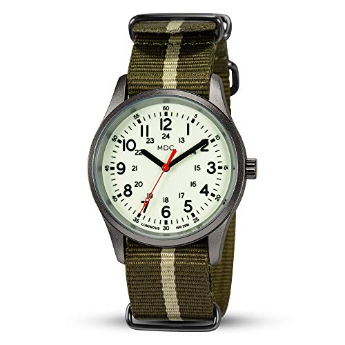
Good value field watch
C3 Super Luminous dial gives a soft green, long‑lasting glow for easier night reading. 38mm case, domed sapphire crystal with AR, and 316L stainless steel add real‑world durability.
Screw‑down crown and 100M water resistance suit daily wear. Very affordable (~$55) — a practical option when strong painted lume and crystal clarity matter more than premium finishing.
Answers: color, tritium, AR and fast checks
Which lume color is easiest for poor eyesight?
Green or yellow‑green tones register best in low light because the eye is most sensitive there; contrast with the dial (bright lume on a dark background) matters more than exact hue. Simple large markers with thick strokes make color advantages tangible.
Is tritium worth it for constant night readability?
Tritium gives an always‑on, even glow that helps in persistent low‑light situations and for slow‑adapting vision. It’s generally dimmer than fresh Super‑LumiNova and will slowly fade over many years, but requires no charging.
Do anti‑reflective (AR) coatings improve lume legibility?
Yes — AR cuts surface glare that can mask luminous markers, especially at angles, making the lume appear clearer and more readable. Single‑side AR or internal AR plus a matte dial yields the best perceived brightness.
Which matters more: lume color or thickness?
Thickness and coverage win: larger luminous surfaces and strokes ≥1.2 mm produce sustained, readable glow more reliably than minor color differences. Prioritize area and shape first.
Quick store test for night legibility?
Charge the hands/markers with a 50‑lumen keylight in a dark corner and watch readability as the light dims; check marker shape, stroke width, and contrast rather than peak flash.
- Prioritize large green/yellow‑green lume areas over narrow decorative accents.
- Choose thick strokes (≥1.2 mm), high contrast, matte dial, and AR crystal.
- Pick tritium only when constant, no‑charge glow matters more than peak brightness.
Practical checklist: choose watches with large, greenish lume fields, thick strokes, a matte dial and AR-treated crystal; prefer tritium only if unattended constant glow is required. Decisive takeaway: large luminous area plus contrast beats any single lume color or spec when reading with poor eyesight.
Humor me: for someone with very poor eyesight, would you recommend tritium on both hands and hour markers, or a hybrid (tritium for hour markers and SLN on hands)?
I’m leaning toward constant glow but worried about overall brightness.